The 10 commandments of printing include a combination of fundamental design elements and production requirements. These encompass some of the basic features required to successfully produce printed products.
Thou shalt not stretch
Stretching your artwork is just lazy…There I said it! There are so many alternatives to overcome slight sizing issues.
If you have the open file, just extend the background image and elements.
If for some reason, you only have a Jpeg or PNG, you can autofill your background in photoshop.
How to autofill in Photoshop:
- • Open your image in Photoshop
- • Adjust your canvas size to the correct size (Image > Canvas Size)
- • Select the “grey” areas with the Rectangular Marquee Tool
- • Right-click in the selection
- • Go to fill
- • Ensure it says: Contents: Content Aware
- • Click on OK and watch the magic happen
- • If your fill wasn’t fantastic, you can always fix it with the Patch Tool
Or you can create a new artboard in whichever application you are using and just add a background colour & blend it in.
Thou shalt not create a border
Most production houses cry a little when they see any form of a border. This is one of the most important rules of the 10 commandments. Be it a white space border or a line border.
Why you may ask? When the machine cuts the flyer, it doesn’t cut them one by one. The machine takes hundreds of pages and cuts them at the same time. If the stack that is placed in the cutter isn’t one hundred percent aligned, the cutting will be off-centre. The chances of it being 100% are very slight which will result in your border being crooked or one side of the borders being larger than the other.

Thou shalt not incorporate low-resolution images
This goes without saying but everybody makes the mistake of low-resolution images. Unless you have a severe case of OCD and check each image before placing it in your artwork. The general rule is that if you view your artwork at 100% in Adobe you can get a pretty good idea of the print quality.
Print houses will advise you to always set up your images as 300dpi. The principle is simple, the bigger you drag an image, the lower your image dpi goes. The best is to set it up to the size used in your artwork and adjust your image to 300dpi.
You can increase your dpi online with the Adobe Free Image Resizer.
A recent study found that buyers in marketplaces are more likely to trust sellers that use high-quality photos in their listings. As a consequence, products with higher-quality images are also more likely to be sold.
Thou shalt not design to the edges
As with the border, designing to the end of your page can have a similar end result. To clarify, when we say design to the edge, we mean the text and crucial elements are finishing on the edge of the paper. Always ensure that the text and crucial images are 3mm in from the outer edge of the artwork. The background visuals must, however, extend beyond the edge of the paper into the bleed area.
If your crucial elements are too close to the edge and the cutter hasn’t aligned the paper stack well, then you will be left with words that are cut off.
Most agencies don’t necessarily have access to the software that will give you rulers to mark it off with thus my advice is to always keep about a centimetre of your edge clear of crucial information. And how do you measure that? Use your index finger when your artwork is at 100% view. This should give you enough space, try it next time and see. What have you got to lose?
Thou shalt not supply as spreads
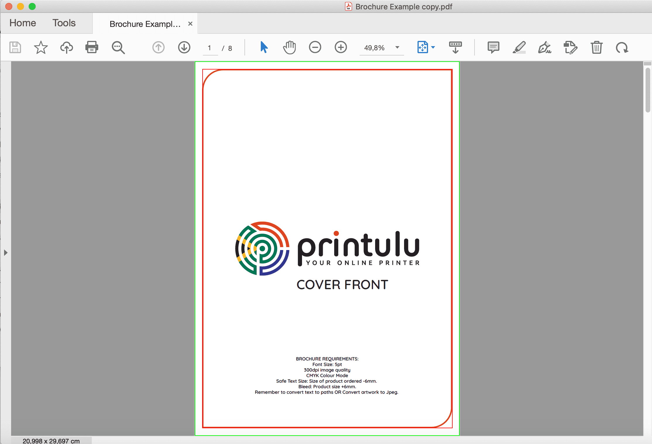
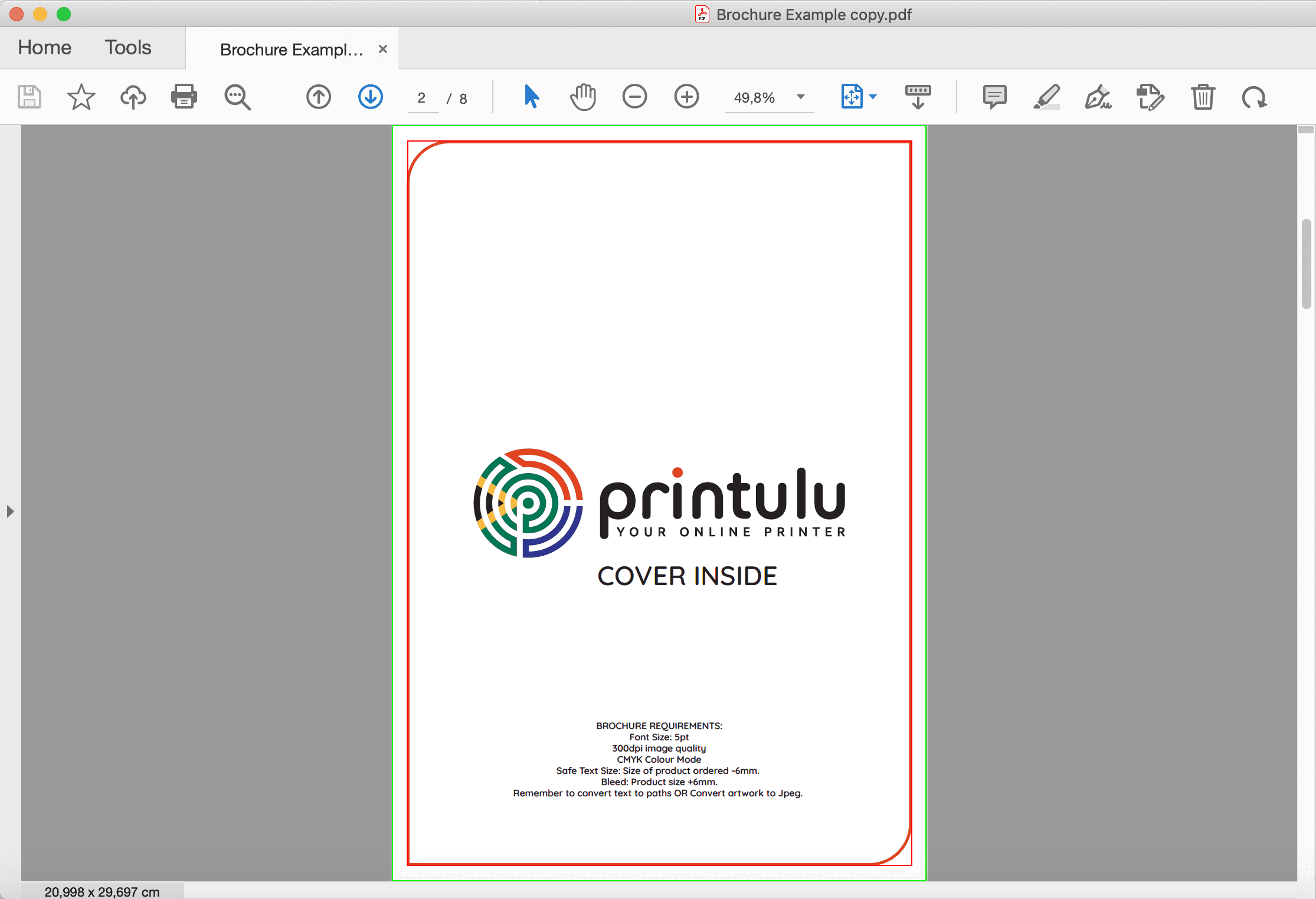
Print production houses have programmes that automatically plan the layout of brochures and booklets. These programmes can not differentiate between a spread and a page. If you supply a spread instead of two single pages, then the programme will think that your artwork doesn’t have enough pages and will probably throw out your orientation. Booklets & Brochures must be supplied as one pdf document with single pages.
PRO TIP FOR THE 10 COMMANDMENTS: Design your booklets as a facing pages document, this will allow your design flow to be accurate visually. Before you save it for print, deselect the facing pages option and adjust the bleed. Most designers export it as facing pages, as a result, your bleed uses the adjacent page BUT when a book is “put together” in the programme the page layout is actually completely different than your end result.
Thou shalt not provide a folded leaflet as single pages
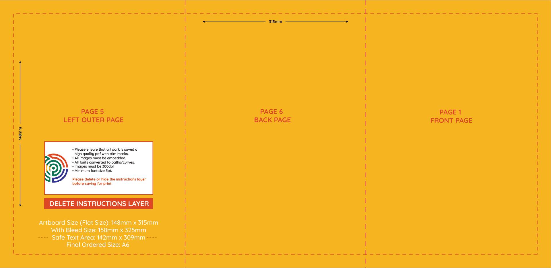
Now opposite to point 5, any folded brochure must be supplied as a flat size because the programmes can distinguish folds. If you ordered a 6-page DL folded pamphlet, your artwork should be a 210 x 297mm Flat Size with two-fold indicated with a spot colour. These programmes can not collate a folded leaflet.
Thou shalt not supply more pages than products ordered
If I had a penny for each order that comes in with the page count and ordered product not matching…Can you say millionaire?
Think of any print order system as a puppy, basic instructions gets the job done. Asking the puppy to sit, lie down, roll over and hug in one instruction is never going to happen. But asking the puppy to sit, Give him a treat. Lie down, Give him a treat. Roll over, Give ‘em a treat. You get the picture. Give me one artwork, for one amount of quantities. Otherwise, we’ll just never get a treat.
Thou shalt not supply artwork as RGB
This is the most important of the 10 commandments. CMYK artwork is the most accurate onscreen representation that you will get. Your artwork will ALWAYS get reported if it is in RGB because the colour display varies greatly from CMYK. In short, any colours produced in an RGB colour mode on the digital space will not create the same colours on the physical print. Designing in CMYK colour mode will give you a more accurate representation of the final print colour.
Here is how to change your RGB artwork to CMYK colour mode:
Thou shalt not supply a password-protected PDF
Print houses understand the need to ensure that your artwork is printed precisely how you supplied it but limiting us in what we can do, can delay your end product. When a print-ready pdf is supplied as password protected or with restrictions, we will have to request a version without the protection which will inevitably delay your print run. Passwords, although useful in some cases, limit us in preparing your document for printing.
Thou shalt not supply an incorrect file format
Just because you can print a word document on your side, does not mean it will look the same when we receive it. Documents alter their appearance depending on factors such as available fonts. It is an industry-standard to always supply print material in one of the following file formats: Jpeg / PNG / Tiff / PDF
Formats that will be rejected include Powerpoint, Excel, Word, Illustrator, CoralDraw, Indesign, and Photoshop to name a few.
Files that can alter their appearance will always be reported because we don’t know if what we are seeing on our screen, matches what you are seeing on your screen.

