There is nothing more frustrating than waiting patiently for your order, and then upon receiving your package discovering that the print came out wrong. We at Printulu want you to get what you expected every time you order with us.
Take Jimmy above for instance. Jimmy printed his first 500 flyers with LOL-printers but he paid an arm and a leg for these. When he ran out of flyers, he decided to print 5000 more and found Printulu to be his cheapest option.
He sent the same artwork that he’d sent to LOL-printers to Printulu, and 5 days later he received his prints.
Upon receipt of his flyers, Jimmy called customer service to complain about the colours. In his exact words, “I hate these flyers! They look nothing like what I sent to you. The print came out wrong. This is not what I asked for.” Much to his dismay, Jimmy took to social media to express his grievances saying that it was Printulu’s fault, the prices are too good to be true and low-grade machines were used to print.
Little did Jimmy know that that was not the case.
There are factors that may affect the outcome of your artwork. It’s important that you are aware of these before placing your print order.
These factors include but are not limited to the following:
1. CMYK to RGB conversion
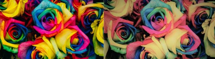
The most common reason customers say that their print came out wrong is because of colour vibrancy issues. The colour vibrancy as you see on screen is not achievable on print because the colour combination used is RGB instead of CMYK. If an RGB artwork is sent to a printer it is risky. This is because scanners, digital cameras and computer monitors use red, green and blue (RGB) light to display colour. Printers instead use CMYK (Cyan, Magenta, Yellow and Black), so if the artwork is RGB the codes do not directly match up to CMYK.
The CMYK colour model is a subtractive colour model, so it works the opposite way to RGB.
- To print on a four-colour press, all RGB files must be converted into CMYK colour.
- Certain RGB colours that you can see on your monitor in particular – bright or blue, green and red cannot be replicated with standard CMYK inks.
A lot of people feel that CMYK art is less vibrant, however there is no such thing as an RGB printer. The best practice is to learn to use CMYK colours to your advantage.
Tips to make CMYK artworks vibrant:
Designing for print is about understanding and working with the limitations of CMYK to achieve the best possible result.
The brightest colour you can achieve for print is a solid of each of the three main colours, namely Cyan, Magento, and Yellow. For example, 100% cyan will give you the brightest blue, and 100% Cyan + 100% Yellow will give you the brightest green.
It is, however, important to remember that when you are working with large pieces of black in your design, that this black should not be flat black, or 100% black. Flat black is dull when printed on large spaces but is ideal for small elements such as text.

The best black to use is a form of rich black, or designer black (pictured lef). This will print a vibrant, deep black. Each designer has their own blend of black they like to use, but the most common one is C=70 M=50 Y=30 K=100
A very important factor in designing for print is to design in a CMYK colour space from the beginning.
RGB converted to CMYK
Many people like to design in RGB, and then convert to CMYK. However, this will often produce unwanted results and leave you feeling disappointed with the final product.
The most important tip is to have fun and experiment. Use colour swatches from images you like, such as the available colour swatches on Pinterest. Although the CMYK colour space can feel limiting, it is important to remember that often less is more. Sure, you may not be able to achieve a luminous yellow, but is it really necessary for a beautiful design?
2. The printing method
You might have seen us mention the process of gang run printing in our previous blogs. The reason why you pay such affordable prices with Printulu is that we use the method of gang run printing.
One of the risks that come with this process of printing is that there might be slight colour variations in the artwork that you are printing, depending on the artworks that it is batched with.
This issue is something that we mitigate by having the best machine minders. However print is a manufactured process, so there will always be slight variations in colour. Slight variations are common. This doesn’t mean that the print came out wrong, however, and can this occurrence can be inevitable.
3. The difference in machines used
Now, you may ask “Why did the first flyers come out fine if the artwork was RGB?”. The first quantity Jimmy printed was 500 flyers, and for smaller runs printers will use a digital machine which will often convert the colours to match. RGB is used for online viewing only, however, it can be pulled off on a digital printing press. It’s important to note that even in this case it’s not always accurate – Jimmy got lucky the first time.
The second time around Jimmy printed 5000 flyers which were a long run printed through the litho press. This is why the print came out wrong the second time around.
Dry toner is used with digital printers and the image is transferred electronically to the paper. Artwork goes through far less scrutiny in this case as digital machines are more ‘accommodating’ of artwork which may have some technical errors.
If the exact same job is printed on a litho press, the likelihood of the colour difference is high. That is why it’s difficult to offer a digital print proof for a litho print job; as it will not be a true indication of colour. Both types of printing produce print products that are extremely high in quality and fit for professional quality printing for businesses.
4. The file
Issues may occur if the file was not supplied as a PDF/x-1a and transparencies and soft masks were used. This occurs when the artwork is designed in non-design software like word and powerpoint, then converted to PDF. The file will not be a PDF/x-1A. This can also happen when the file is not saved accurately from the design software.
5. Paper stock and finishing
In printing, you have coated paper and uncoated paper. Coated paper has a matte or gloss finishing which is mostly used for flyers, business cards, brochures, leaflets, etc. The uncoated paper would be your bond paper, which is used for letterheads, notepads and desk pad calendars.
It is important to note that if your print came out wrong, it could be because colour prints differently on these two types of papers.
Uncoated paper is more absorbent, therefore when the ink is applied, the colour will look different to when the same colour is applied to the less absorbent coated stock.
6. Unrealistic expectations
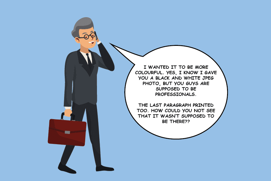
Another issue is the expectation of a different product than what was supplied. If the artwork that was initially supplied is black and white, there is, unfortunately, no way the outcome will be a full-colour print. The design you supply is what will be printed for you. This is why we go to such lengths to make sure you are aware of any issues there may be with the artwork you have supplied.
You have to indicate when an order is placed that you would like to pay for a redesign. It’s not possible to get a unicorn when you have supplied a donkey.
Related Articles:
- How to get the perfect large format print
- What are printing proofs and when best to use them?
- Print Ready Artwork – An Easy Checklist
- What kind of printing company doesn’t have a normal printer?!