“Make it simple. Make it memorable. Make it inviting to look at.” – Leo Burnett on advertising.
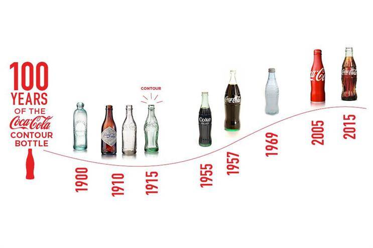
When you choose an advertising strategy, this is some golden advice to follow. Most of us do, but choosing how you design your leaflets or pamphlets should be no different! Your brand is ever-evolving. Just think about how many different bottle designs Coca-Cola has gone through. Yet, everyone still recognizes the brand. The job of advertising is to make your brand as memorable and inviting as possible. The question is how do you do this when memory is such a complicated thing? The answer, surprisingly, lies in science!
I can already hear the sceptics laughing. Design, art and advertising… related to science? But it’s true!
Are you here to order pamphlets and/or leaflets? Check out our awesome Folded Leaflets & Pamphlets with unbeatable prices and free delivery all over SA!
What difference does how I design my pamphlets make?
Advertising can be broken down into two main categories. The first is digital, and the second is tangible paper advertising, such as leaflets and pamphlets. With advertising, we want our product or information to be the first connection consumers make when they see a need. Better yet, we want to remind consumers of a need that isn’t always apparent to them. So how do we do this?
A study conducted for the Mass Communication Quarterly in 1998, showed that significantly more advertising material was remembered and recounted by subjects exposed to written print. The scientists argued that this was due to ‘hands-on’ physical exposure to information and a lack of distraction.
Your font choice has a bigger impact than you think!
A 2010 study proved that hard-to-read fonts were the best for memorizing and recalling information. The downside to this is that these fonts are, obviously, hard to read. We don’t recommend using hard-to-read fonts on your pamphlet designs, though. You obviously want your clients to have a good experience with your brand. The secret is to find the happy medium between the two spaces, and use it to your brand’s advantage.
What about colour?

Memory isn’t just affected by difference in medium or font though. It has been proven time and time again that colour has an effect on your overall mood and ability to retain memory as well! This is why it should be a central consideration when you design your brand and advertising collateral. Another interesting study by Dr White of Ohio University even found that coloured, print advertisements attracted readers 42% more than black and white ads. He also was a strong believer in the fact that the blue light you typically get from your screen has a negative impact on your ability to retain memory. A study using colour and paper, kids!
I can take this one step further. Different colours have been linked to different levels of arousal. I know what you’re thinking – no, not the naughty kind of arousal. I’m talking about the kind of arousal that can make you some very big bucks in the long term. The more arousing or emotive the colour, the more memorable it is.
Here are just a few examples:
- Red – for importance and ultimatums.
- Yellow – for stimulating mental activity.
- Blue – for memorizing general themes rather than details.
How does this benefit me?
This is where memory, basic colour theory, common sense, and social science interact. After reading this, you’ll have a basic theory on memory testing. But every consumer will have their own memories attached to a specific colour, shape, and size. But that doesn’t mean that this basic knowledge can’t usually influence your design decisions – and it should. For example, orange is almost globally associated to some degree with autumn and Halloween. It’s a colour associated with warmth, happiness and comfort. These are all super positive emotions that you can evoke in your customers with one well-executed pamphlet design.
With the right tools (and the right printer) you can use your own colour/memory connections to take advantage of customer memory and the fact that print has a one-up on digital information retention. All it takes is some thought into what you want your customers to remember after reading your beautifully coloured pamphlet. Keep it real and keep it colourful!
P.S. – If this all sounds great, but you have no idea how to get started, give our professional in-house design services a shot.
Related:
- Top 5 Best Free Design Software of 2019: Design Like A Pro – FOR FREE!
- Design Manuals: The Crucial Branding Tool You Didn’t Know About!
- Our Game-Changing Design Process: And How To Use It