Coca Cola. What image comes to mind? Surely, right now, you’re not picturing a clown with pink and blue hair. No, the very first thing you think about when I say Coke is the signature red and white of Coca Cola’s logo design. Paired perhaps with the fizzy brown bubbles that we all love.
This is the power that a good brand logo can hold. If that hasn’t sold you on the idea of a logo yet, think about this. Imagine that you are in China, or Thailand, or Russia, where you can’t understand a single thing on any of the signs. You spot a big, yellow M, and you feel immediate relief. McDonald’s! Thank goodness, this is food you know, at least!
If your business’ logo is powerful enough, people will start to associate an idea or feeling with the image. Ultimately, you want people to associate good feelings with your business. That is why a logo is so important. It is an immediate trigger to that person’s emotions. And when people feel, they buy.
At Printulu, I’ve experienced many weird and wonderful requests from clients. Being the in-house designer at Printulu can be super rewarding, but it can also, unfortunately, be incredibly frustrating. I want my client’s businesses to succeed. However, when a client asks me to use the low resolution picture that they downloaded from a shady site on the internet on a large banner, I can’t help but cringe.
Your business is not low-rate, so why would you want it to appear that way to your customers? In the same sense, you would not rock up to a job interview wearing sweatpants and your grandma’s hair curlers. You put your best foot forward, because we live in a world where the book is most definitely judged by it’s cover. So here’s how to make your logo stand out!
1. Be Unique and Clever
In many cases, imitation is the best form of flattery — with logo design, that’s not true. Every few years or so, some new fads come along in logo design. I personally love to study design trends and you might even find me suggesting jumping onto a few bandwagons to keep up with the times. But with logos, it doesn’t make sense to imitate everyone else.
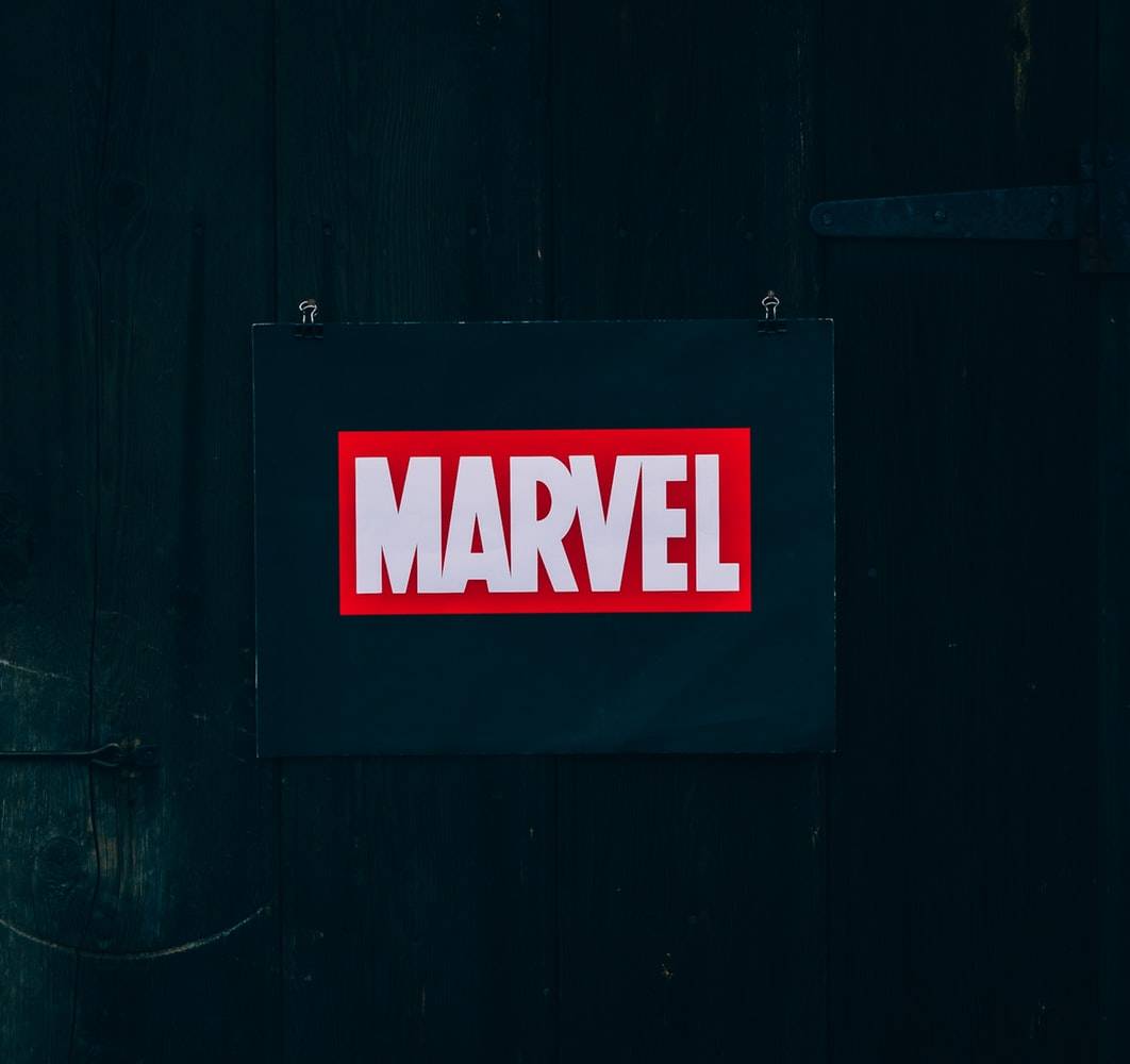
Rather than following the herd and using a cliché design, you should instead strive for something that is uniquely recognizable. A logo is what helps distinguish a brand from its competitors, so it’s important that the image stands out from the rest — something many brands struggle with. The BMW logo isn’t a car, but everyone recognizes it and knows it’s a car brand.

2. Understand the Brand
Every good logo has a story. Yes, a logo is an image, but it’s also an introduction to a brand. The logo must reach a specific audience and when designing, you must keep this in mind. Write down what you think about the brand; perhaps even create a mood board with imagery that reminds you of the brand’s ideology.
3. Colour is Key
One of the most important considerations for logo design is the color palette. But beware, this is not a superficial decision! Please, don’t choose a colour just because it’s your personal favourite.
When taking the brand’s personality into account, you have to think about every aspect of the image. Bright and bold colors may grab someone’s attention, but could also seem brash; muted tones exude sophistication, but could be overlooked. Every color has a different implication and can bring nuance to your message — don’t fall into the trap of conveying the wrong message because of a simple brush stroke. The Logo Company released an article “The Science Behind Colors” and an infographic displaying The Psychology of Color in Logo Design. Here’s a quick break-down:
- Red: energetic, sexy, bold
- Orange: creative, friendly, youthful
- Yellow: sunny, inventive, optimism
- Green: growth, organic, instructional
- Blue: professional, medical, tranquil, trustworthy
- Purple: spiritual, wise, evocative
- Black: credible and powerful
- White: simple, clean, pure
- Pink: fun and flirty
- Brown: rural, historical, steady
These meanings can change depending on culture, though, so do your research! And remember that a good logo is versatile and will still function well in grayscale.
4. What’s in a Name?
A logo consists of two elements: A word-mark and a symbol. Before a company can think about solely representing itself with a symbol, a great deal of advertising must be done (think Starbucks or Mercedes). Some companies choose to stick to Logotype entirely, like Google.

5. Keep it Simple, Stupid!
At Printulu, we even have a poster with this wording on it, because it’s SO important. Simple but powerful logos permeate the business world and always prove to be the best icons for standing the test of time.
It’s important to have a balanced combination of simple and quirky — you want your logo to be interesting, but you don’t want someone to have to sit and stare, analyzing the logo.
6. Don’t Expect Instant Success
Nike; Puma; Audi — all iconic logos, but like with anything successful, it took time for these to gain popularity. Logos won’t become instantly iconic, even if you’ve designed the most beautiful combination of vectors. It depends on the product’s success and the market in which it exists.
7. Use Online Resources and Tools
There is a vast sea of information online for those who need some inspiration, collaboration or assistance when designing a company logo. If you’re looking for a quick start with a logo design, experimenting with a logo template can be a great initial step. It can help give you a starting point for your logo design, on which you can build and adapt.
Use Pinterest to give yourself some inspiration, and don’t be afraid to sketch out multiple ideas. And remember, if you can’t come right, I’m always there to help. Printulu offers professional design services at low prices, so don’t stress if you don’t have a logo just yet!
Resources
10 Tips for Designing Logos That Don’t Suck
Related Articles
5 Things Your Letterhead Design MUST Include by Law! (Everyone Forgets Number 2)
Our Game-Changing Design Process: And How To Use It
Top 5 Best Free Design Software of 2019: Design Like A Pro – FOR FREE!
Design Manuals: The Crucial Branding Tool You Didn’t Know About!
The Best Design Websites for Non-Designers (Design Like a Pro)
10 Design Do’s and Don’ts You Don’t Want To Miss! (Designers Cringe at Number 3)