Stickers are an effective and fun way to promote your brand, showcase your creativity, and engage with your audience. Whether you’re designing stickers for personal or business use, it’s important to follow certain graphic design principles to ensure that your artwork stands out, communicates your message effectively and most importantly is print-ready. In this post, we’ll explore 7 must-follow graphic design do’s and don’ts for creating your sticker artwork successfully.
The Top 7 Graphic Design Do’s & Don’ts for stickers:
DO #1: Use the minimum font size requirement
One of the most important aspects of sticker design is readability. Make sure to use a font size that is easily readable from a distance. The minimum font size for Printulu Stickers is 8 points due to the fact that we use a UV ink printer. The minimum font size requirement should be followed to ensure that your message is legible. Ensure that you use bold heavier letters instead of lighter fonts as the “spray” from the printer will result in lighter fonts almost fading away. Trust me on this one, bold is better.
DO #2: Use 300DPI images at the correct size
Using high-quality images is crucial for creating a professional-looking sticker. Pixelated images can make your design look amateurish and unappealing. Ensure that the images you use are relevant to your brand or message and that they are properly sized and placed in your design. Printulu requires 300 dpi images for all print-ready artworks.
I’ll let you in on a secret here. Set your image up in the size it will be in the artwork. If your design is a 30cm x 30cm image and you have a 20cm x 20cm image at 300 dpi, your artwork will be low resolution because the dpi of an image goes down when you drag it bigger than the original size. This is one of the main problems when it comes to image usage and pixelation. You can use the AI Tool called Let’s Enhance to enlarge your image. Below is also a video on how to resize your image in Photoshop.
In the second video, I show you where to change the image size, the resolution and how to soften texture or slight pixelation. This is a golden learning experience as I know of countless designers that can not fix their image quality the right way. Let’s face it, you might not always have the perfect image quality but this workaround in graphic design will help you countless times.
DO #3: Include your cutline
A cutline is a guide that shows where the sticker will cut. It’s important to include this in your graphic design process to ensure that your stickers come out looking exactly as you intended.
A cutline setup varies from printer to printer but the basic principle stays the same. In your colour swatch, create a new colour swatch. Make the colour swatch value (C:0; M:100; Y:0; K:0:) or another value as long as the cut line looks completely different from the colour scheme of your design. Lastly, set your colour type as a spot colour.
Now that you have your spot colour set up, it’s time to create the cutline. The basic idea is that you want to create an outline for the whole design and then put the outline on a separate layer. It can not be done in a raster-based program such as Photoshop. For raster-based programmes, you will need to create a separate artwork. This will be covered in point 5.
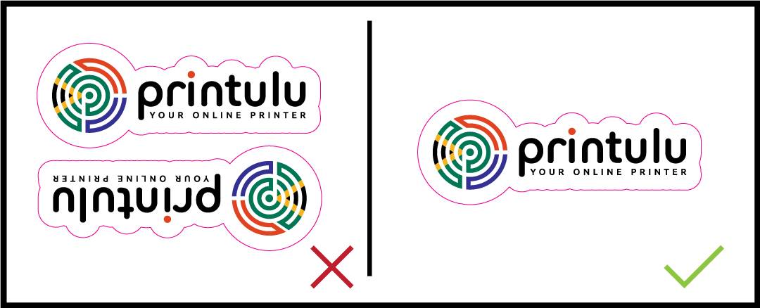
DON’T #4: Design your artwork two-up
Designing your artwork two-up means designing two identical stickers side by side. There is no reason to do this, we have programmes that calculate the most efficient layout thus giving you the best price for your stickers. While this may seem like a good way to save on printing costs, it can result in an uneven cut and make your stickers look unprofessional.
DON’T #5: Set your cutline up in a flattened artwork
Flattened artwork is an image that has been merged into one layer. If your cutline is set up in a flattened artwork, it will be difficult to edit or adjust. Keep your cutline in a separate layer to make it easy to modify. For raster-based programmes: You can not set a cutline up in the same artwork file. You will need to create a separate file to indicate where you expect the cutline to be. So upload the artwork without a cutline and another version with the cutline. Below is a video that will show you how to create it.
There is software you can use for this but it is paid thus the responsibility for this payment falls on the design agency as they will need to supply print-ready graphic design artwork. If you want to look into this, you can look at the product offerings of Cadlink.
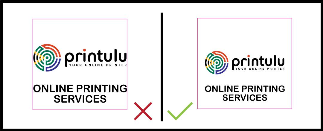
DON’T #6: Use text right up to the border
Using text too close to the edge of the sticker can result in a cut-off or incomplete message. Keep your text within the safe area to ensure that it will not trim off during the cutting process. The safe text area for stickers is 5mm all around. This means that your text must be 5mm in from the size of your ordered stickers.
DON’T #7: Forget to add bleed to your graphic design element
Bleed is the extra margin added to the edges of your design to ensure that there are no white spaces or borders around the edges of your sticker. It’s important to add bleed to your design to ensure that your sticker looks professional and clean.
Stickers require a 5mm bleed all around. There should be NO text in this area. It should only include the background artwork. If you supply an image with white bleed, you run the risk of having white edges on the final result. This is due to the fact that cutting almost never aligns.
Here are the three main graphic design tips for designing your staller stickers:
- Keep it simple: A sticker should be easy to recognise and understand at a glance. Avoid overcrowding your design with too many details or elements. Instead, focus on using a few key elements thus creating a clear and memorable image.
- Use bold colours and high contrast: Stickers should be eye-catching and stand out from their surroundings. Using bold colours and high contrast will make your sticker more visible and increase its impact.
- Consider the shape and size of the sticker: Stickers come in many shapes and sizes, so it’s important to choose one that fits your design. Consider the shape and size of the object you are sticking the sticker on, as well as the context in which the sticker will be used to ensure the best end result. For instance, a small circular sticker works well on a laptop, while a larger rectangular sticker is better suited for a bumper sticker on a car.
Follow these tips as a guide for your next large print run, and always trust your gut instinct! Remember, you can order the above-mentioned products at printulu.co.za, or give our customer care line a call at (010) 593 0558, and a helpful agent will be more than happy to assist.
Related Articles:
- Stickers – Your Full Guide
- How To Apply Your Printed Custom Vinyl Stickers In 4 Easy Steps
- How To: Design and Prepare Stickers For Print (Sticky Business)
- The Complete Printing Guide

